Raster and Image Analysis
These are all projects that pertain to raster and Image analysis. As such, these may appear in other pages as well as in this one.
Raster Analysis
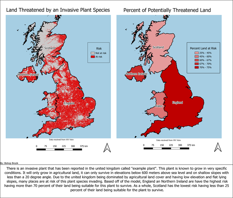
I found this exercise online and completed it to practice raster analysis in QGIS. For this exercise I was given a set of criteria that a hypothetical invasive plant species thrived in. I was also given 100m DEM and land cover data of the united kingdom. to do this, I created a binary output grid using Euclidian distance, raster math and a built in slope tool. This produced the data I used to create first map on the layout above. this map shows which areas are at risk and which are not.
from here, I went on to calculate what percentage of land in each country was at risk. To do this I used raster math to count all of the cells that met the criteria and divide by the sum of all cells in each country. This produced the data I used to create the second map on the layout above.
All of the data was symbolized and labeled in QGIS. I then used the built in layout builder to create each individual map and associated map elements. I found that the built in layout builder wasn't ideal to handle two map frames and their associated features, so to combine the maps into one layout and to add the summary I exported the maps out to Inkscape where I created the final product seen above.
Image Analysis
This map displays the burn severity of a fire that occurred in Angeles National Forest in 2016. To create this I used 2 Landsat 8 scenes, one which was collected before a forest fire and one which was collected after the fire. These scenes had 7 spectral bands each including 3 visible light bands, 1 near infrared band, 2 shortwave bands and 1 blue edge band. For this analysis I calculated normalized burn ratio (NBR) for the pre and post fire scenes, then using those results I calculated difference normalized burn ratio (dNBR). These calculations use the ratio of near infrared and short wave infrared bands. Larger dNBR ratios indicate more severely burned plant life. However, this does not mean all pixels marked as moderate to high severity are always accurate. For example, water is often also marked as moderate to high severity. This can be seen in the north western portion of the map.
This analysis was done using QGIS then symbolized in ArcGIS Pro to be published to ArcGIS Online. The web map is imbedded in this webpage, All layers can be toggled on and off using the built in legend which can be found in a side bar on the left side of the map beside the map extent control widgets. A description of the map as well as a description of the layers and more information about dNBR can also be found here under the tab called "details".
This analysis was done using QGIS then symbolized in ArcGIS Pro to be published to ArcGIS Online. The web map is imbedded in this webpage, All layers can be toggled on and off using the built in legend which can be found in a side bar on the left side of the map beside the map extent control widgets. A description of the map as well as a description of the layers and more information about dNBR can also be found here under the tab called "details".
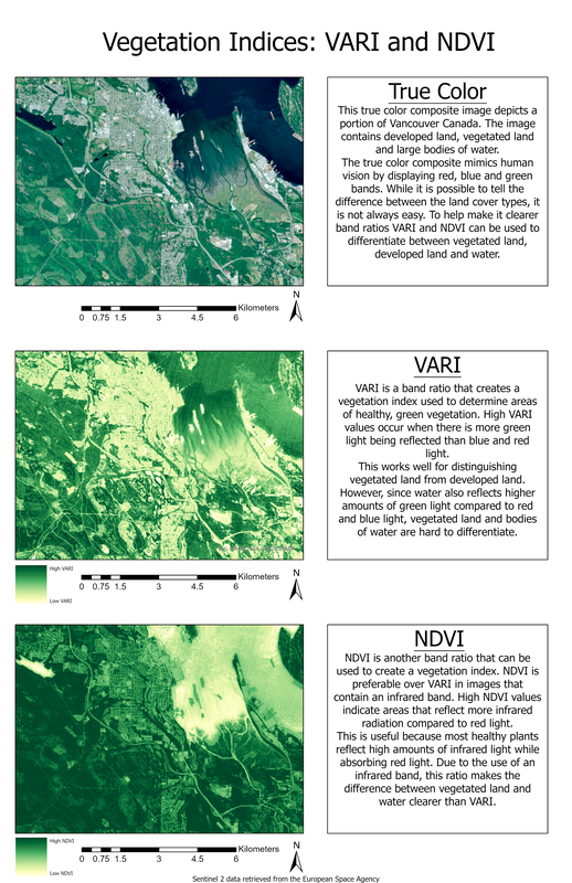
The purpose of this map layout was to demonstrate how certain band ratios are useful for analyzing features that aren’t easily distinguishable using true color images, specifically finding areas with high concentrations of green healthy plants. To demonstrate this, I chose to symbolize an extent using 2 band ratios to compare to a true color composite. Specifically VARI and NDVI. This analysis was conducted in ArcGIS pro using raster math, then the layout was created using the built-in layout builder.
Georeferencing
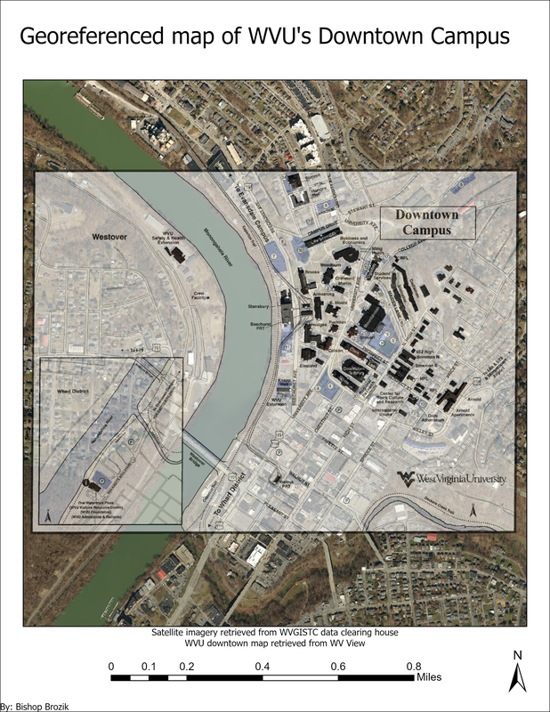
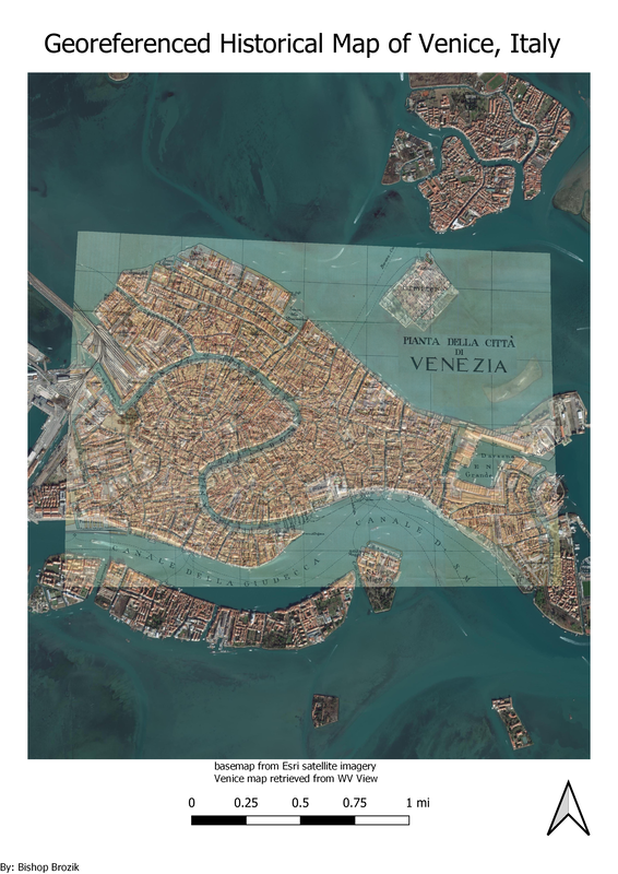
These maps were georeferenced using ArcGIS Pro and QGIS respectively. The WVU downtown campus map was an assignment from my first GIS Course that I took in the spring of 2019. I was given an image of the downtown WVU campus and told to georeference it so it would render over its actual location. To make this easier, I found high resolution satellite imagery from the West Virginia GIS Technical Center Data Clearinghouse instead of using ESRI's built in base map imagery. The second layout was one I have created since I graduated when I was learning how to do basic tasks in QGIS. The data was retrieved from WV View. While the process is similar, I found it to be easier to use ArcGIS Pro to georeference data.
These Assignments were very similar to what I did on the first project I worked on at the West Virginia GIS Technical Center as an intern. Here, I was tasked to scan in WV DOT road plans, process the images using Adobe Photoshop, Build PDF's using Adobe Acrobat and then most importantly georeference the maps using ArcGIS Pro. during my time on that project, I georeferenced over 600 road plans. Unfortunately, I do not have access to these maps nor would I have permission to share any of them here.
These Assignments were very similar to what I did on the first project I worked on at the West Virginia GIS Technical Center as an intern. Here, I was tasked to scan in WV DOT road plans, process the images using Adobe Photoshop, Build PDF's using Adobe Acrobat and then most importantly georeference the maps using ArcGIS Pro. during my time on that project, I georeferenced over 600 road plans. Unfortunately, I do not have access to these maps nor would I have permission to share any of them here.


